Stop Animation Origami Frog
I experimented with paper folding and then I took individual shots to create an animated frog.
I experimented with paper folding and then I took individual shots to create an animated frog.
31/10/2007
The purpose of the animation within the banner is for entertainment value and to illustrate movement.
The banner is also enticing when you click on the button to see how the product works.
and to hear different sound effect from the mosquitoes and spray. The idea is to convey the message of advertising.
The Theme of:
“Ladybird Photography Spotlight Photos”.
The purpose of the client project is to produce a Website and banner on the theme of ”Ladybird Photography Spotlight Photos”.
The name Ladybird Photography identifies with photography and Spotlight Photos is used for Civic Functions, Funerals and other events.
The unique name “Ladybird Photography Spotlight Photos” is used to incorporate all of the Lord of Hastings businesses altogether.
For the Website it will have a Corporate Identity Package is to establish and maintain a corporate identity. It is crucial to the success and professional appearance of a company. The corporate identity package is ideal means to creating a complete theme and style for the business.
Creating a corporate identity is one of the most important stages in building brand awareness.
The logo is important and represents a distinctive attribute and is for the business.
I will design a layout to create complex pages for my Web Site to be both versatile and visually appealing.
I have some new ideas for the new website.
30/11/2007
The purpose of this research project is to investigate how a multimedia-teaching aid can be constructed and used to help support people with Autism.
I will initially research into the background of Autism and will investigate which is the most appropriate learning and thinking style to establish what methods are most likely to work with children with autism, who generally relate best to visual material, movement, colour and multimedia content as opposed to language based verbal material.I will also research and evaluate existing multimedia learning packages.
30/11/2007
I have summarised and evaluated all the different individual elements within the research and come to conclusion that all the different concepts work better together and suggest that the way forward is to produce an educational video.
Comparing and contrasting all the different learning styles has differentiated the most appropriate, reliable source to accommodate the children with Autism.
The literature suggests that Origami is an appropriate activity for teaching important skills to children. The cognitive style that Origami encourages are appropriate to the needs of Autistic people. Origami introduces important mathematical concepts and the art of folding involves sequence, much repetition, drill and practice, which is the type of activity those with Autism relate to. Using Origami as the platform can provide opportunities for developing attention, concentration, memory skills in the individual and encourage interaction and building relationships with peers. and
It appears that the methods most likely to suit their learning and thinking style and to encourage social interaction, social communication, co-ordination and imagination are mainly visual approaches. As well as being visually based, Origami is very ‘hands on‘. It would also be appropriate to incorporate animation and an auditory element into the activity through the use of sound effects to make a multisensory experience.
Using all the extensive elements of research findings will work together. The Origami, cognitive learning style is most appropriate for a video demonstration because it it is an effective intervention for teaching.
Collaborating all the unique styles into one process will create a new inspiration learning experience educational video.
The ultimate purpose of the reseach intervention is the same; to enhance quality of life for children with Autism. Like all typically developing children, children with Autism all desire and deserve better education and higher quality of life. A step towards achieving this would be through the development of a multimedia learning package to teach Origami.
31/10/2007
The purpose of the animation within the banner is for entertainment value and to illustrate movement.
The banner is also enticing when you click on the button to see how the product works.
and to hear different sound effect from the mosquitoes and spray. The idea is to convey the message of advertising.
09/12/2007
I designed the Banner in Photoshop
Designing the spray, I experimented using paintbrushes to give an effect to make it look like spray dispersing from the bottle.
I gave a new look for the LOGO to compliment the rest of the Banner.
09/12/2007
I designed the buttons in Photoshop and then saved them for the web. When importing them in I inserted them in as a rollover to give a better effect.
Planning Process 19/10/07
Client Project- Proposal
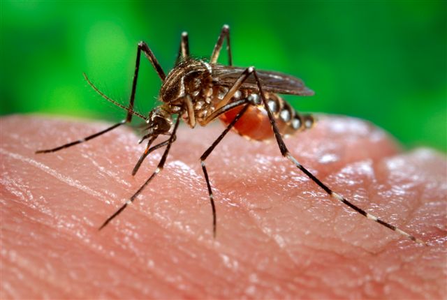
The purpose of the client project is to produce a microsite and Flash banner on the theme of ”Insect Repellent.
The promotional site will have creative designs and new imagery and will contain 5 pages.
It is very important in influencing how people think and feel about the your site. The identity significantly will demonstrate how they can prevent illnesses and promote their product.
Within the microsite will consist of a comprehensive range of Jungle formula products? They are recommended in the UK because they have been on the market for 20 years. Jungle formula is very effective and powerful and keeps different variety of bugs away. Reference to: [online] available at: http://www.jungleformula.co.uk/index.html [Accessed on 22/10/07]
The purpose of the client project is to produce a microsite and Flash banner on the theme of ”Insect Repellent.
The promotional site will have creative designs and new imagery and will contain 5 pages.
It is very important in influencing how people think and feel about the your site. The identity significantly will demonstrate how they can prevent illnesses and promote their product.
Within the microsite will consist of a comprehensive range of Jungle formula products? They are recommended in the UK because they have been on the market for 20 years. Jungle formula is very effective and powerful and keeps different variety of bugs away. Reference to: [online available at: http://www.jungleformula.co.uk/index.html [Accessed on 22/10/07]
Hospitals have given approval for tropical diseases for travellers. It is highly recommended to use extra strength lotion for protection to help travellers visiting tropical places because there is a high risk of malaria and other insect transmitted diseases
Homepage
The content of the homepage is quite significant in that it provides more personalised information and choices for visitors.
For example these qualities are evident when the user is finding information is comprehensive.
When planning the homepage, it is essential to be clearly accessible for each page on the site. It displays organisation and consistency throughout the site.
The main navigation will be on the homepage and the main sections of the website will be one click from the homepage.
It will display organisation, logo and links to a page with contact details.
The requirements are significant that it is clear, concise and understandable content, as it is important to target a wide audience.
I used Ariel font because it provides friendly appeal to the body text on the page.
The text will enable to interact with the images so people are able to read and understand it, certainly it will also help with the look and feel of for the site.
Spacing is important to me in getting everything into perspective and proportionally organised.
However, text needs to be placed in a tidily and organised way to fit well on the pages.
The colour of text within the navigation contrast with the content on the homepage. Every page on a website should have contrast and coordination when designing a layout, which evidently has. The appropriate web colours are used to differentiate between different types of information.
In terms of browser compatibility it is very important when considering the potential audience and to consider the visually impaired. Although the design is identical on every browser, it enables the site to continue to be usable and functional.
Graphics
Use of Alt-tags will be descriptive within the content and graphics. It enables you to link to another page that has a text explanation.
Techniques
The range of techniques being used:
• CSS
• HTML
• Alt-Tags
• Meta-Tags
• Image manipulation
• Flash animation
• Actionscript
• Photoshop
I used Photoshop to design all my ideas; one of them is a graphic technique using the tools subtly giving it depth and sophistication to the design.
For the background image, I have given opacity of 20% so when placing the text over it everyone can visibly read it clearly.
I designed the boarder with leaves to enhance the banner and I used the same effect for the rollover buttons to compliment each other.
Designing the spray dispersing from the bottle, I will experiment using paintbrushes to give an effect.
In addition meta-tags will be included on the index page for search engine optimisation.
In terms of accessibility and usability, I will use animation sparingly within the banner to promote the product.
Animation will not be used within the body text because; it is too distracting and inaccessible. It is appropriate to convey the message clearly and concise.
Each page will have a route or direct link back to the homepage and a link with the contact details.
10/10/2007
Research project for Multimedia.
Overall aim and rationale of the research project.
The purpose of this research project is to investigate how multimedia can be used to help support the learning of people with autism. This study is important because of the growing numbers of children who are being identified as being on the autistic spectrum and who will mostly be educated within the mainstream classroom.
Objectives
The specific question that will be addressed is what digital content is most appropriate for an educational video for children with autism that will keep them interested and help them gain knowledge and understanding.
Methods
This will be determined by producing a series of six videos describing to children with autism how to produce an origami object. Initial research will have been carried out into the learning and thinking style of people with autism to establish what methods are most likely to work taking into account that people with autism have difficulties with communication and social understanding and interaction. Each individual has a different profile but generally people with autism relate best to movement, colour and visual material and multimedia content as opposed to language based verbal material.
The digital variations of the educational video for the six artefacts would be as follows:
1. Voice over and demonstration of making the origami object hence using visual and auditory methods.
2. As number one above but with the addition of complementary background music.
3. Diagrams and images providing a step by step sequential guide on how to produce the origami object.
4. Animated text and demonstration with background music but no voiceover.
5. Freeze frame- animated sequence of the finished product with no sound.
6. Stop animation with music but without voiceover.
Evaluation
Each video will be evaluated using a variety of methods. Most importantly, the children will be videoed as they try to build the origami objects after watching each video. I will also interview their class teachers for their feedback. I may also talk to the children themselves directly although this may be problematic due to their communication difficulties. To accommodate this, it would be necessary to find out the nature and extent of the child’s difficulties beforehand by consultation with the teachers and to work with the children to gain their confidence.
Having established what methods work best for the greatest number of children with autism, a piece of educational software might then be developed incorporating the most appropriate digital format and effects for engaging these children and for supporting their learning.
During the summer I was feeling quite frustrated because I didn’t know which direction I was going in, in the terms of my research. Deborah kindly organised a meeting with David so I can discuss my research. I had been thinking very carefully and given it considerable consideration about the subject of the human brain and I had already written up my proposal for it. When I discussed it with David, he thought it would be better to change it because of it being a scientific route and the amount of time involved.
At first, I wasn’t clear in understanding on how to produce the Artefacts, but David spent a considerable time explaining to me in his email.
From this point I understood the concept
I took another route but this time I have to be thinking of ideas in the terms of presenting different variations of an educational video in Origami to Autistic children.
During this summer I had been working on several projects. My priorities were to re-do and submit the web-design assignment, which was for 1,500 words. I submitted the work in on the 3rd of September. I was waiting for my results to whether it had got me through to the next stage. Unfortunately I handed in the wrong assignment although it was all accurate according to Simon but it was still classed as a fail. Apparently I was supposed to have been sent a new assignment from administration but never received it. I was told to re-do a new assignment. Nether mind I thought the assignment was interesting and inspiring. The topic was to compare two websites in the terms of Accessibility and Usability.
Web Design & interfacing Media
Research and analyse the homepages of http://www.nhs.uk/and http://www.colgate.co.uk. I will compare these two pages in terms of their accessibility and usability and also discuss the merits of each site. There will be a debate for which site, in accessibility terms, is the most compliant.
According to Custom Webhelp LLC. 2007 [online] available at:
http://www.customwebhelp.com/non-technical-website-guidelines.shtml good websites will help people to communicate globally providing it has good functionality and relevant information. [Accessed 22 September 2007].
As pointed by Apis Design, Inc.2007 [online] available at: http://www.apis.ca/Understanding_Websites/Good_Sites_Bad_Sites/What_makes_a_good_website.htm#case [Accessed 22 September 2007] websites should be consistent in their approach for example in the use of colour, font size and style of graphics, credibility, and originality and in content as many forms as possible in order to suit people’s different thinking and learning styles. The layout should be appealing and appropriate with good quality graphics.
It is widely recognised, for example by the Royal National Institute for the Blind (RNIB) see it right accessible website directory 2007 [online] available at: http://www.rnib.org.uk[Accessed 22 September 2007];also by the Disability Rights Commission (DRC) accessibility guidelines 2006 [online] available at: http://www.drc-gb.org/accessibility.aspx; [Accessed 22 September 2007] and The Dyslexia style guide of the British Dyslexia Association (BDA), [online] available at http://www.bdadyslexia.org.uk. [Accessed 22 September 2007] that a website needs to be accessible and user friendly, enabling people to navigate easily. Designing sympathetically for a wide audience for accessibility is necessary because there are a significant proportion of people using the web who have one kind of disability or another. This includes people with impaired vision.
The National Health Service website is strongly recognised by it’s Logo Identity. They like to keep their identity, as it is very important in influencing how people think and feel about the NHS. Their identity demonstrates how they treat illnesses and promote health. In contrast, the Colgate logo identity is recognised for promoting the organisation and selling their products.
All communications on the NHS website must express their values and principles [online] available at: http://www.nhs.uk/ [Accessed 27 September 2007].
The NHS is extremely efficient with its guidelines, design style and technical standards for its websites. The NHS is widely recognised nationally and communication is important to make sure the site and its content can be easily used and understood by a multiple audience. The NHS likes to keep their values; efficiency, professionalism and be committed to the health service. The care provides the best experience for users and this is reflected on their home page.
The content of the NHS homepage is quite significant in that they provide more personalised services and choices for patients, and other NHS organisations.
It maintains high standards of design and unique content for services rather than duplicating information provided elsewhere. For example these qualities are evident when the user is finding out about different illnesses. The level of detail is high and the range of information is comprehensive.
It is very significant that NHS meets the requirements for clear, concise and understandable content, as it is important to target a wide audience.
Accessibility
Accessibility is a requirement for a professional website that provides National Health Services care and Colgate homepage definitely does not meet this need. They certainly have not considered the partially sighted and other disabilities.
According to Colgate website it does not comply with the guidelines in terms of accessibility, but they are open to “suggestion to improve the usability of the site”.
[Online] available at: http://wwwallhealth-info.com/shared/accessibility.asp [Accessed 8 October 2007].
Alt-tags
Alt-tags are used frequently within the NHS website and is the most important elements of Accessibility to almost all users. It must be clear, descriptive and meaningful. The purpose of the Alt-tags is to assist vision impaired Internet surfers using screen reading software.
In terms of browser compatibility it is very important when considering the potential audience and to consider the visually impaired. Although the design doesn’t have to be identical on every browser, the site must continue to be usable and functional.
It is very obvious with the Colgate website, as it differentiates between one browser to the next in terms of different font sizes and screen sizes. Their homepage doesn’t have the facilities for accessibility, which I am quite surprised at, as it is a big organisation nationwide. It should accommodate people with all disabilities.
The homepage banner of Colgate has inconsistency with the navigation buttons.
When you hover over the navigation buttons horizontally, it brings up the same information on the front page scrolling down vertically.
The colour of text within the navigation doesn’t contrast with the content on the homepage. Every page on a website should have contrast and coordination when designing a layout, which NHS evidently has. The NHS uses appropriate web colours (black, white and blue) and also uses colour to differentiate between different types of information.
Browsealoud is a speech enabling program which allows web content to be more accessible to anyone with difficulties reading. It will also help visitors navigate easily. [Online] available at: http://www.nhs.uk/accessibility/Pages/Accessibility.aspx
[Accessed 8 October 2007].
In terms of accessibility and usability the NHS homepage is clearly technically accessible and usable. The main navigation menu is on the homepage. It displays organisation and consistency throughout the site.
Each page has a route or direct link back to the homepage with the contact details.
The navigation is consistent throughout the site.
The NHS website provides image maps that help visitors to find relevant information quickly.
In comparison with the NHS homepage the Colgate homepage (Colgate website [online] available at: http://www.colgate.co.uk. [Accessed 8 October 2007] is much harder to navigate and inconsistent in terms of its usability. For example, the home link, which is at the bottom of the page, takes you to another page displaying rotating flashing objects and beneath them are more flashing images, which is quite distracting. All that was needed to view this page was a link to take you to an image map and give you information about the product. Comparison to the NHS website gives you adequate information and an image map to find your way around without any complications.
It does not meet accessibility and usability requirements because there is not a link to go back to the homepage, but with difficulty you can just about see that the home page can be re-accessed using the back button. The visually impaired will have great difficulty in accessibility.
The NHS websites consider the needs of people who might find it difficult to use the web, for example the physically impaired or learning disabled, inexperienced, non-English speakers.
Furthermore they work with the Disability Discrimination Act, which you can find [online] available at: http://www.primarycarecontracting.nhs.uk/98.php [Accessed 8 October 2007].
When required the NHS website makes reasonable adjustments to give a wide scope for accessibility to their sites and meets the regulations that is “compliant with the law” in the UK. It is nationally recognised for its specifications and ability to meet the W3C guidelines
Readability is an important factor because if you do not have good content you are unable to read and it needs to be well organised: the key factors we need to be aware of are fonts, images, contrast and colour.
Reference to viewing the NHS websites [online] available at: http://www.nhs.uk/ [Accessed 3 October 2007].
Typefaces
The NHS font, which is identified with their websites, is Ariel/Helvetica. These sans serif fonts are easy to read on screen to help a wide audience.
NHS meets the needs of other spoken languages so they can understand the different typefaces and is usually 12pt, big enough to read easily.
They use appropriate styled text to comply with the WCAG guidelines which can be found
[Online] available at: http://www.w3.org/WAI/intro/wcag.php [Accessed 8 October 2007].
In comparison, the Colgate homepage does not display text big enough to enable the viewer to see clearly.
Images and Graphics
Visibility is another important factor on how the homepage is displayed. NHS values
their principles on how images and graphics look because they are powerful in the way they represent their identity. NHS values are demonstrated strongly as colours and typefaces.
They think about the type of image they will use which is relevant to what they are promoting.
The NHS use pictures to show their professionalism and respect in the way they care, certainly they don’t use any images that reinforce stereotypes about people.
It is very noticeable that there is no animation on their site as it would be inaccessible to many users.
They have made sure that all of their images have alt-tags.
Animation has been used quite frequently on the Colgate site in both images and text. From my point of view it not advisable as it is very distracting, confusing
and inaccessible.
Communication
Evidently the NHS strongly uses clear concise communication, which is honest and open. They use language that is appropriate to a wide audience. Many of the users will be patients who may be worried about their health. The language that is used is to show empathy and understanding and helps them to find the part of the site that they want quickly.
Advertising
It is also evident that the NHS does not advertise on their homepage; it is more about promoting a healthy living life style and being dedicated to their patients.
Colgate does advertise when they are promoting their products but it is not so evident on their homepage as it is with the rest of their site.
It would be ideal situation if Colgate used NHS techniques, skills and professionalism in making their site more compliant.
It was on March 18Th when my grandchild was born. She is now 6 months old and crawling around. I was so overjoyed when I found out it was a little girl because I wanted to have at least two girls myself. I do now get on well with my two sons although were difficult in the past. What is so special about Kaydeelea, is she has the same astrological charts as me. We are the 12th sign of the zodiac which is
Pisces and the 12th astrological sign of the Chinese year which is the year of the PIGIn June I was invited to the Press Conferencs on the lauch of the film Human Trafficking.
This essay will examine the important influence of multimedia in today’s global communication systems. The wide-ranging applications of multimedia as a tool of education, business and entertainment will be explored. Graphic design /film and web design will be particularly focused upon as these are the areas of my main practitioner interest and are part of my career pathway. The skills I have already developed will be described and also how these have been acquired will be mapped out as well as my future prospects within the context of multimedia.
It was certainly a lot of hard work especially when it came to editing the content of my footage.
As time went on I became more creative, thinking of new ideas to improve the Documentary.
I continually experimented with optimising the sequence of scenes; I did a colour correction on some of them to give a better balance throughout the sequence.
I ultimately worked through hours of footage in order to find a solution to put everything together approximately taking 10 -15 hours to edit everything down to 90 seconds.
Attachments:
You replied on 4/11/2007 9:33 AM. Sent: Tue 3/13/2007 6:30 PM
This message was sent with high importance
From: N0078516 To: N0132685
Subject RE: Interview
Hey Janet.
Right where should i start. If you meet me in the staff room (108 WAV) tomorrow at 10.45am then
i will be able to take you to the studio and interview you after i have finished interviewing danny kaye.
The questions are as follows:
1) Why did you choose NTU?
2) Why did you choose multimedia?
3) What do you think of the multimedia course?
4) What are the modules and what do they involve?
5) What do you think of the staff at NTU?
6) What are your future ambitions if you graduate?
I need approximately 20-30 second answers for each question if possible. I really do appreciate your help.
Your a life saver.
Thank you Sukdeep Nanua
Oh and if you have any problems then please do not hesitate to contact me.
FRIENDS
The 4-minute documentary will feature the two friends Freya and Nettie 5 and 4 years of age. As they talk about there friendship and what it is for them, which makes each the other ‘best friends’. The documentary will be a mix of interviews with the two cuties and we also follow them as they run around and play, fall out and make up again.
DVD DESIGN
The DVD I will design will be the highest standard with laser printed front cover packed in see-through folder. It will feature the film with text and contain pictures. The front cover title will say Friends with some script.
The audience of all ages will enjoy this happy film about friendship.
During the Christmas Holiday I wanted to do my research on how to make templates for a DVD cover and disc.
I have never had any experience in this area before but I was willing to be creative and to come up with some ideas.
First of all I took plenty of photographs from my digital camera and chose the best quality images that would suit the documentary.
I opened up Photoshop and explored different styles and blending options in layers.
I experimented for a long time to make it look right.
I did have a problem with scaling the images to size to fit the DVD cover but with a lot of practice I eventually got the result I was hoping for.
PREPARATION FOR MAKING FRIENDS DOCUMENTARY
Because of the nature of the documentary it was a good idea to get to know the children and spend time to get to know them. This was probably the best idea we had for the whole project as it gave me the opportunity to get the feel of what is happening around me and to make them feel at ease.
I found it an invaluable experience and really helped to put my focus in the frame of mind as a part of the production team. I was in a real place of responsibility, as the children responded positively to me and enjoyed the fact of having me around.
My focus was in allowing the children to play naturally and have fun and for me to build enough rapport with them.
It gave me the chance to get to know them properly and make them feel comfortable, so that Iain Green could start filming.
This proved to be a good day for filming; everything went accordingly to plan.
This was important when it came to editing the content of our footage.
We were now able to capture everything we had to the editing booth. Then began the long process of sifting through the hours of footage in order to make the documentary the required length.
It was realty interesting to edit this film as the more we edited the more we learnt about our topic and ultimately the more we liked the idea and its results, there's something rewarding about making a film your not totally in control. We did encounter some group dynamic and hardware problems but when hurdles were over-come a good team effort was built and everyone still involved really worked well to bring it together.
DVD AUTHORING
Tuesday 16th January
I arrived at the editing booth ready to export the finished documentary. We had backed up the project on a USB hard drive.
I was feeling quite frustrated after learning that the presentation was for the following morning and not giving me adequate time schedule to finallise the complete finishing touches for the DVD Authoring.
I managed to take the footage of the documentary home with me so the group was totally relying on me for the finished product.
I found it very useful that I had previously gained some knowledge of authoring a DVD while I was up in London visiting my Sister. The workshop I did explained everything about DVD authoring so I was able to put that into practice.
I ultimately worked through until I could find a solution to put everything together.
I put DVD menu buttons along with extras and a slide show of high quality production, one for Movie, Slideshow and Extras.
The images I used for the slideshow were from my digital camera, I also used a transition on them for the introduction.
I did have a few technical problems along the way as I lost the work three times and had to repeat what I had already done until it was corrected.
It was time consuming because the next procedure I burned the DVD with all it's content.
It was now 3.30am and ready to put the final finishing touches on the designed DVD cover.
I completed all of this by 4am Wednesday 17th
I believe I worked very hard to have the DVD finished by the required deadline.
Wednesday 17th January
I arrived at 9am to present the finished DVD.
I was feeling quite nervous at this time because I did not want to let the group down but as a result it all went well.
For automatic copyright, your work has to be completely original and this implies to your own creative and design idea and must be made by you.
If your design is original and you do not intend to reproduce it, you will receive automatic copyright protection against illegal copying.
Copyright does not protect ideas for a work. However, when an idea is fixed, for example in writing, copyright automatically protects it. This means that you do not have to apply for copyright.
Reproduction right
Only you can reproduce that piece of work in a fixed form.
Modification right
Only you are allowed to alter it or allow somebody else to alter it.
Distribution right
Only you are allowed to distribute.
Public performance right
The right is read /broader work in the public domain.
Public display right
Same as above
You can sell you rights permanently or if you intend to use other people’s work, use the ones you can buy or ask the author.
Copyright is automatic right regardless if a copyright warning is not given.
The amount of a person’s work you use is irrelevant, you still need permission.


Before Christmas I went down to the Victoria Centre to take photographs I took several so I can choose the best quality image for my Web Banner
The cat is famous throughout China and has attracted interest around the world. 'The most interesting thing I have received is a protest letter from a person in Florida, USA, last year,' Xu told reporters. 'The person urged me to help the cat lose weight and not to spoil it anymore.'
A photo of the cat with its owner was attached to the letter. The writer may have a point.
It is said the cat can't lower its head to eat anymore because of its weight, meaning its owner has to raise its bowl with a plank.
The super fat cat also sleeps on it's back like a human, and has a pillow and blanket.
With a little help to get it onto the bed it likes to lay on its back and have its belly combed.
The cat has become a star in Asia with a video of it appearing on YouTube.
However, it has a long way to go yet to beat the record for the fattest feline, as a cat from Minnesota recently tipped the scales at 38kg.
Last year Metro revealed what was thought to be the flabbiest cat in Britain; seven-year-old Honey, who weighed in at 19kg. The tortoiseshell-moggy started life as the runt of her litter, fitting in the palm of Bournemouth resident and owner Ashley Morano's hand.
Unique, Iconic, Inspirational-Award winning.....
At 42 metres high, the Rocket Tower stands proudly as the famous symbol of the National Space Centre.
Space technology is about far more than exploring the Universe. In fact, it now plays a crucial role in our every day lives here on Earth - from satelite navigation to weather forecasting and telecommunications.
The power of planets is awesome.
So it's little wonder that these weird amd wonderful worlds have mesmerised mankind throughout the ages.